Thursday, May 19, 2016

End of Year Reflection

LEARNING
Over the course of this year, I have learned many new skills that would help the rest of my high school career. One major thing that I learned was how to manage my time well, and get projects done before they were due. I will admit that this first semester was a rocky start, but once second semester rolled around, I knew that there was no time to play around, so I just kept moving forward.
The way that I learned how to do it was through trial and error. Through the first semester, I was on YouTube a lot instead of doing my projects; I was distracted in class, and was constantly having my mind veer off to different places. But when I saw that my grade was suffering because of it, I decided that this was not a time to be goofing around, and that I had to get my work done.
Managing your time is important because, as a sign above the doorway to the Convergence Journalism room put it best, “Due dates are closer than they appear”. I did not realize that there was so little time that was given for working on our projects, that I just kind of blew it off until the last minute. And when the due date rolled around, in layman’s terms, I was screwed.

STRENGTHS/WEAKNESSES, IMPROVEMENT
         My biggest strength in this class, once I got the hang of it, was my creativity. One of my projects, the flight path navigator, I decided that having a simple flight path with a plain rocket wasn’t fun enough. I colored it to look as best like an X-Wing from Star Wars as I could do, added a couple of TIE Fighters around the area, and put a Death Star from where the flight path started. My greatest weakness was staying on task. Since there are people in this class that I am glad to call my friends, I got sidetracked very easily. Also with the temptations of the Internet at my fingertips, I always wanted to do something other than the work I was provided. I have improved in the fact that I get on YouTube a lot less than I did at the beginning of the year, and I got more projects done on time.
WRAP-UP
         What I am going to do with the information that I have learned is try my hardest to apply my skills into my career. When I get out of high school, I want to work in movies. I do not care if that’s as an actor, director, or something (preferably actor), but I want to work with films. With this information, I will try my absolute hardest to take what I have learned and make sure that nobody else in the production suffers because I could not do something.
         What I would have changed is how I started the year. It was a really rough start to a good year, and I just wish that I could go back and start it all over with a clean slate, and hopefully get this grade to where I want it to be before winter break.

         Overall, even though I’m leaving to go to Entertainment Video (yes I know, I’m a traitor), I still had a lot of fun in this class. I learned a lot of useful skills that will help me later on in my high school years. I am glad to have been apart of this class, and to have gotten to know everyone in this class.

Monday, May 16, 2016

Sophomore Animation Final!


The scope of this project to bring together the three main points that we learned this semester, which were how to fuse 3D modeling with real life, using special effects to make something blow up, and using a green screen.

We used storyboards to make the basic gist of the project, using little drawings and graphics to make it seem fun. After that, we went out into a random hallway in our school, filmed, and then went into our green screen room near the convergence journalism room, and filmed the black and white shots. After that, we went back to our classroom, and had a group member make the 3D grenade model, pieced it all together, and then we finished! TADA!

We learned that filming in an improperly lit green screen room is absolute *bleeped out word*, and that trying to work with that kind of green screen sucks. They desperately need proper lighting in that room. We also learned that working in a team with an animation project is one of the hardest things in the entire world, so patience is key.

We would have gone down to the green screen room and filmed earlier, as well as started the modeling process for our grenade earlier so we weren't rushing to get it done at the end.

What we would have done the same was the overall story. It was fun to make, and actually worked out in the end.

Overall, this project was challenging, fun, and very rewarding in the end. I'm glad we got it done at the time that we did, and I know that the skills that I learned are going to come in handy when I continue my high school year.

Wednesday, May 11, 2016

3D or 2D?

http://www.animatorisland.com/why-2d-animation-should-be-abandoned-part-1/

       This article is a controversial article in the animation community, and can actually be a controversial article in overall terms if you really think about it. It's about whether we should fully abandon 2D animation altogether, and just go full-on 3D animation. The author's argument is that we SHOULD abandon 2D animation, for three major reasons, it's easier, can have more attention to detail, and that 3D animation has a better way of making a scene more subtle.

       The first point that the author makes is that 3D animation is easier than 2D. They use the fact that you just have to set up a model in the CG program that you're using, and then move it accordingly. You can even hook up a rig from your buddy's project, and keep the animation flowing smoothly. In 2D, you have to constantly redraw every scene or character over and over with a little bit of inconsistency because of the fact of drawing a tiny bit differently than before. The author also uses the fact that 3D animation can get the tiny details better than 2D can. If you look at a more modern animated movie, say, Frozen (*shudders*). The attention to detail in that movie is absolutely outstanding compared to a more modern 2D animated movie, The Princess and the Frog. The final point that was made is that subtle movements look a lot better in 3D animation than 2D animation. If you look back to movies like Pocahontas, the slower scenes really seemed to be hard to follow, since the character wasn't moving as much as they normally would. Since 3D animation has more options to make it realistic to actual human movements, so slower movements are easier to see and animate than 2D animation.

       The author has many strong points, and actually brings in an extremely popular and talented 2D animator to help strengthen their view on the Subtlety section. The 2D artist, who worked on some of the animations for Disney, most notably Mushu in Mulan, said that with 2D animation, making a scene subtle is extremely difficult because of the different lines, as well as trying to make the character still, but not so still that they blend into the background. With 3D animation, there is a clear model of the character, and a clear model of the background, so there is no worrying about the character becoming one with the background. Looking for weaknesses in this article is very difficult, so the only one I can really bring up is the fact that the author seems very biased. If they were to just acknowledge the other side every once in a while, that would help further the point they're trying to get across.

       The general conclusion that the author came to in this article, is that 2D animation is slowly starting to go out of style, no matter what people say, and that 3D animation is starting to take over. In my personal opinion, I think the argument that the author makes is very relevant. To prove my case, I will show you two movies that have different scores on Rotten Tomatoes. The one on top is The Princess and the Frog, and the bottom one is Big Hero 6.


       As you can see, in the course of five years, critics have started to warm up to 3D animation. Granted, that isn't a big change in score from an 84% to an 89%, but the main portion that needs to be REALLY looked at is the Audience Score. PatF got a measly 74%, while BH6 got a MASSIVE 91%! Just to be clear, according to audiences, Big Hero 6 was almost as good as Star Wars Episode VII was to critics. It's safe to say that the author of the article's viewpoint was legitimate, and holds up to the evidence.

       Since I'm not going into animation next year (yes, I know Mr. Netterville, I am a traitor), this doesn't affect me in hardly any way in videography other than if I ever wanted to make an animated movie project if I become a director, it has to be a 3D animated movie with the visuals being highly up-to-date, and almost breaking boundaries in terms of storytelling and acting.

       Overall, I really like this article. It brings points that bring some food for thought onto the table about whether 2D animation is still relevant, and if 3D animation is the way to go in terms of cartoon-y animated movies. One thing I have to address, in terms of TV shows, 2D animation is thriving. With amazing hits like Gravity Falls and Steven Universe, 2D animation may have a future on smaller screens instead of the giant ones.

Tuesday, May 10, 2016

Science Kombat

https://www.behance.net/gallery/34335649/Science-Kombat

This project seems like a goofy little side project of someone working on something more important, or a game that a guy got an idea for, and decided to make a goofy rendition of. It's a fighting game like Street Fighter or Mortal Kombat, but it uses famous scientists from history. Some notable examples are, Nikola Tesla, Albert Einstein, and Stephen Hawking. The "Story Mode" is where you have to go through all of the fighters, and get to the final boss. Spoiler alert (and a funny one at that), the final boss is a representation of Gods to form a being called The Divinity. The different fighting forms of The Divinity include Ganesha, Thor, and a representation of Christian God called Omnipotence. It really is a clever game, and a fun one at that. I recommend you go play it for yourself.

The pixel animations for these fighters/boss is outstanding. They represent the historical figures that they're based off of very well. Even the attacks that the characters use are historically accurate (go figure). Tesla uses electricity based attacks, and can pull out a giant electricity laser gun to fire at his opponents, Albert Einstein can bend space and time in some of his attacks, and Steven Hawking uses a black hole in one of his specials. It really is a clever and interesting game that should be played. Shame that the text in the game, other than the names, is is some Hispanic language.

The "story" is your classic fighting game, stereotypical "fight them all until you get to the boss, and beat the boss so you can win". It's also really funny that they would have the final boss as God, even though some of these scientists believed in God or did so before getting into science.

If I were to bring one element into my own animations, it would be the amazing movement and models of the pixelated characters. They are wearing what the scientists in question wore in question in some of their most famous photos or paintings.

One thing that I have added, is the simple walk cycle. Every character differs from each other in terms of personality, what they're wearing, and how they compose themselves, so they each have to have a different walk cycle to show their "status".

Overall, the creator did many things well. The art itself, the inspiration for the attacks, the final boss (which I still find hilarious), and it really is difficult to find something wrong with it.

The only thing that I would say is wrong, is that every bit of text in the game is in a foreign language, and I can't figure out what it is, or what it means. Luckily, the character names are in English, so that's good.

Overall, this is a very well-done project/video game, and I would totally buy it if it were on Steam or some other game purchasing site. I highly recommend it.

Friday, May 6, 2016

Technical Animation

For this blog post, I'm going to be showing you how to make a simple rocket ship in the program Maya! It's a lot easier than you think, and it's kinda fun once you get it down.

This tutorial is also one where I assume that you already know how to set up a project in Maya, so you can go ahead and do that first.


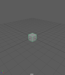
After that, and after you've set up the save function for your file, go ahead and set up a 3D cube model.


BE SURE TO SAVE OFTEN!! Maya is know for being kind of a jerk when it comes to saving projects and not crashing, so if your close button looks like this, save after a while.


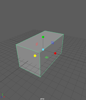
After you have the cube ready, use the resize tool to make it however big you want it.


Hold down the space bar, and select the "face" tool. this will allow you to select the different faces of the object and edit them separately from the rest of the object.


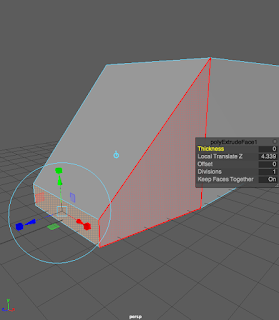
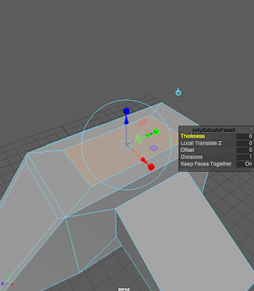
The first face that we'll be working with is the front face. Select it, go up to "Edit Mesh" and select "Extrude". It's the one with the little "^E" next to it.


After that, use the Extrude tool to pull out the face a little, and resize it using the same tool. Then, move it down so that it's parallel with the floor.


Select the slanted face on the front face, and use the Extrude tool to resize it to make it look like this. We're going to leave it like this.


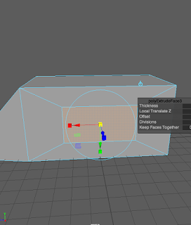
After that, you are going to select BOTH the right and left sides of the ship, and use the Extrude tool to make the sides look like this.


Then, pull the sides out and make them a little bit smaller. Then, move them so that they're parallel to the ground, just like the front. One side might go up, just set that one down by itself.


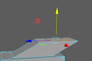
After that, we're going to messing around with the top. Once again, you're going to use the Extrude tool to make the top look something like this.


As you may have noticed, we're going to be doing a LOT of extruding. You're going to click Extrude again, and pull the top up and a little bit away from the front of the ship.


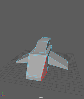
KABOOM!! You have made the basis for your very own rocket ship! Now, add some different textures and dress it up all pretty.

Tuesday, December 15, 2015

Tech Tutorial


       These kinds of blog posts are solely dedicated to showing you how to do stuff with things. Not specific enough for you? Yes? Deal with it. Today, I'm going to be showing how to make a basic pen in Maya.

        I'm making a certain pen that I own for my animation final in Maya myself, so all I'm going to do is go back and look at the past incremental saves I have, to show you what I went through.

        Let's just assume that you already know to set up a new file in Maya, as well as all the layouts and what every tool means. I also should have mentioned that this tutorial is for those who already know how to function Maya, and just want to make stuff. Fear not, let me be your guide!

Just a lonely little cylinder
        The base of the pen is the easiest part. All you have to do is make a cylinder on the plane


          And scale it to the proportions that you want your pen to be.
What's this? Cylinder is evolving!
Congrats! Cylinder evolved into a... Taller Cylinder?


        After that, move the camera so it's aiming down at the top of the cylinder, and hold Right-Click on your mouse. After that, select the "vertex" option, and you should see a bunch of purple squares where the "points" of the circular top should be. 


Points on a circle? How does THAT work?
       After that, move the very middle of the cylinder top up until you get it to where you want it. You do NOT have to put it in the same place as mine, mine is just placeholder for your creation.

NOW it's starting to look like a pen!
       After that, make another cylinder, and move/form it so it's directly in the middle of the pen, where the point is. There should be absolutely NO tip of the pen showing. 

Look, Ma! No top!

       After that, select the two cylinders. This part is extremely important, so pay attention. MAKE SURE YOU SELECT THE LARGER CYLINDER FIRST!!  If you accidentally select the smaller cylinder first, then the entire base will disappear instead of the cylinder. After that, go to the "Mesh" option on the bar at the top, and go to Booleans-Difference. After that, the newer cylinder should disappear, and you have a hole in the top to put the part where the ink comes out (I have no idea what it's called, don't judge me).


Where the ink comes out


       After that, the project is yours! You can make the pen and ink-distributer however you want! I hope your pen turns out much better than mine!

Story Animation Blog


     So, I made a full animation using After Effects, and the end result is something that I think is better than anything else I have ever done! Basically, I had to edit a character in Photoshop, upload that into After Effects, and then make a story with it using backgrounds that I made in Photoshop as well. The entire project was fun to do, and I just let my imagination run wild! It was seriously a fun project, I can't stress that enough.

       My original idea was to actually have two characters fighting to "save the universe" or some cheesy crap like that. Instead, I started to think about having one of the characters steal something, then the other character try and get it back before the main character leaves. I then realized that that would be way too difficult to animate in the time that my teacher allowed. So I just went for the traditional, "Person-Creating-A-Universe" idea. It turned out way better than I imagined, and I am very proud of my accomplishment.

       I learned many helpful components along the way. Like how to make it look like the character in my story was turning around to walk in a different direction. Another big thing I learned was how to make a walk cycle. True, that had been an earlier project in the semester, but I mean I learned how to incorporate it into a story. It was a (somewhat) grueling process, but it paid off in the end.

       What I would do differently in the future would definitely try and find the final product for my animation towards the beginning of the time allowed. I was going through idea after idea until I found what (I had initially thought) was the final idea. But the after that, I kept thinking and thinking, and then I came to a new, and better, conclusion.

       Then there's the prospect of what I would do the same. I would love to use the character model again, because this one was very easy to work with, and turned out to be very cooperative when it came to positioning his arms and legs. And the whole process of making the animation, I wouldn't change for the world. After Effects is a very good program to use, and I would love to keep using it.

       I will OBVIOUSLY try and keep an idea earlier on in the project until the absolute end of it. I needed to find an idea, and stick with it, but I had to start over multiple times. What I would do in the future is just try and use my time better to my advantage, because I only have a limited amount of time before the project window is up, and I didn't realize that at first.

       This project was so much fun, and I would love to do it again! I hope that we do more projects like this in the future! When my teacher reads this, I hope he knows that story projects are super fun, and that it's a good way to use the imagination that so many of us need in our tech-driven age.